
Member Map
Member Map puts your members on a map so you can see your catchment area. Use it to plan leaflet drops, see which areas you aren’t reaching yet, or think about where a second location could go.
Who can use it: coaches and admins. It may not be included in every plan. If you don’t see it, ask Kakuto.
Open it from the menu: Members & Classes → Member Map.
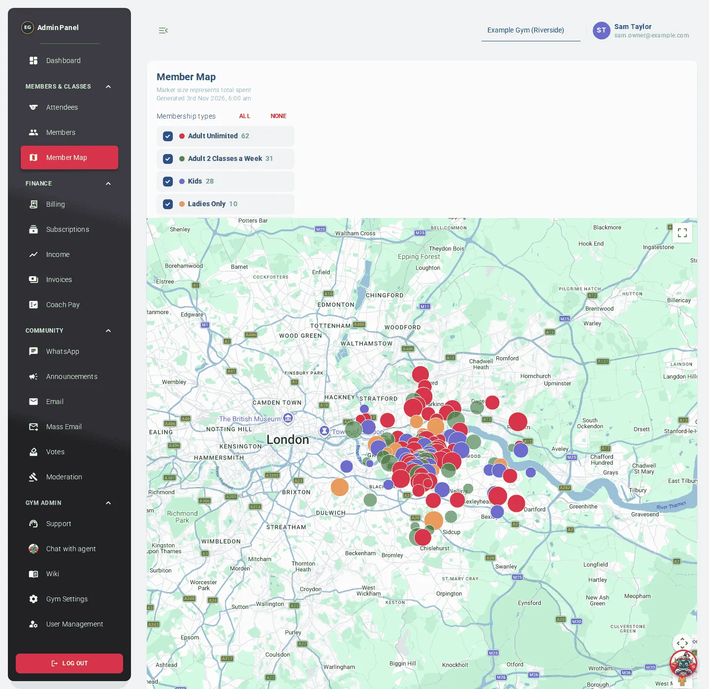
Reading the map
Section titled “Reading the map”- Each circle is one member with a known address.
- The colour shows the membership type.
- The size shows how much they have spent in total. Bigger means more.
- Click a circle to see the member’s name, membership type, plan, total spent, postcode and email.
The panel above the map shows when the map was last generated, and a line at the end of the filters such as “120 of 150 members shown”.
Filters
Section titled “Filters”On a computer, the filters are always shown above the map. On a phone, tap Filters to open them.
- Membership types: tick the types you want to see. All and None tick or clear them all. Each type shows how many members it has.
- Transport overlays: show Tube stations, Elizabeth line or DLR stations on the map.
- Group at nearest station: hides the individual members and shows a yellow circle at each station instead, with the number of members who live closest to it.
On a phone, tap Hide filters to close them again.